Craft.co
Redesigning an advanced search feature for enterprise business analysts

Company
Craft is a market research tool used by business analysts to discover information about companies, markets and industries
Role
I redesigned the UI and UX of the existing search feature to accommodate the needs of enterprise analysts. I conducted research, low fidelity sketching, high fidelity design, prototyping, and validation testing
Timeline
Six weeks, 2019
Skills
Research, sketching, high fidelity design, prototyping, validation testing
The problem 💣
Enterprise business analysts and everyday users have different needs and goals when filling out a search query
Advanced search filters have become a commonly requested feature among frustrated enterprise analysts whose needs are not being met
The opportunity 🙏
Design an advanced search feature to allow enterprise users the ability to search and filter relevant information
Empower enterprise users to organize information according to specific variables and ranges in their search
Final designs and results
Since enterprise business analysts and everyday users have different needs and goals when conducting market research, designing a new search portal specifically catered to the needs of enterprise users became an essential next step for Craft. Now, enterprise users can filter for the most relevant information and organize their search results according to the specific variables applicable to their needs. I delivered the high fidelity designs, a video walk through of the prototype, and the validation testing findings before the end of the six week sprint

First step: research
My research for this project primarily involved market research with the goal of familiarizing myself with standard UI/UX patterns in advanced search features. I looked at competitor and comparative products to determine which filters in an advanced search may be applicable to Craft’s product and users
My research process in this project was not as extensive as it was in other projects since the bulk of my work involved redesigning a feature of an existing product. The goal of my research was to familiarize myself, rather than present new research findings to the client
Low fidelity sketching
I drew several iterations of low fidelity sketches, each highlighting a different method of portraying the search filter criteria. The sketches aimed to improve the UI of the advanced search filters by reordering the left sidebar elements and making small improvements to each piece. The sketches were all informed by data collected from the market research process
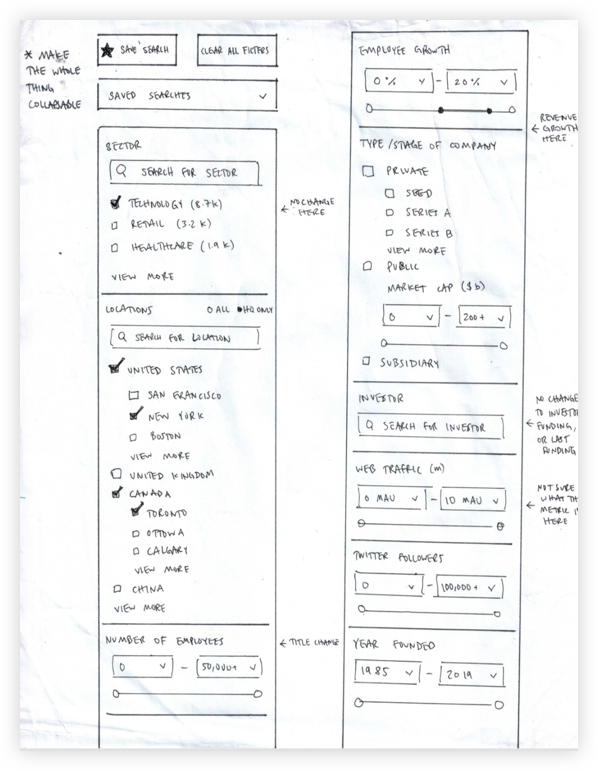


I ultimately decided to draw the most inspiration from the first iteration, which primarily involved non-invasive UI alterations aimed at improving usability and engagement
High fidelity mockups V1
Once the low fidelity sketches were refined through critiques with the client and other team members, I moved on to creating my first iterations of high fidelity mockups in Figma. The high fidelity design process was highly collaborative between designers, which allowed us to pivot and iterate in real time
After running validation tests with users, we learned that a pivot needed to be made in the design


The main takeaway from the V1 high fidelity design was that the search filters column was too long. Validation testing showed us that users didn’t like scrolling down the page so far that they lost sight of the search results, which is ultimately what they were trying to see
High fidelity mockups V2
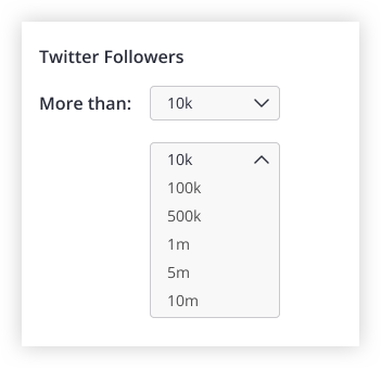
Our V2 design took an entirely new UI and UX approach to the advanced search feature. Rather than having a single sidebar filter list, we brought all of the filters onto cards in one large modal window. Now, users fill out their advanced search criteria all in a single screen, without losing sight of any of the fields

In the V2 design, I moved the sidebar search filters onto cards in a large modal window. Our validation testing showed that this UI and UX change allowed for better usability and engagement since users were more likely to fill out all of the search criteria in a single go
Deliverables
At the end of each week during the sprint, I delivered one piece of the project to the client to keep them up to date and to promote transparency. Before the six week sprint came to a close, I delivered the final high fidelity designs, a walk-through video of the prototype, and the validation testing findings to the client
In addition to the advanced search filters page, I was also responsible for designing all of the possible interactions that a user could take from the advanced search feature. This included things like saving a search, naming a saved search, an error state if the new saved search had the same name as an existing one, and a re-naming a saved search. This challenge presented the opportunity to consider every possible outcome and result that a user might face given a particular action


Takeaways
Over the course of this project, I learned how to rapidly iterate on seemingly small, yet important details. Since the majority of my work involved making UI and UX changes (rather than creating an entirely new feature from scratch), I could dedicate a good chunk of my time to the feedback-iteration loop. By the end of the project, I had made dozens of designs for each individual search filter, and was able to get validation on almost all of them