
Twitch
Rethinking Twitch’s mobile onboarding experience
Case study

Company
Twitch is an esports streaming platform that allows players to stream their own gameplay, and viewers to follow along in real time
Role
In a two week sprint, I generated hypotheses, ran guerrilla usability tests, synthesized my findings, generated low fidelity and high fidelity designs, ran validation tests, and iterated on the designs
Timeline
Two weeks, 2019
Skills
Guerrilla user research, sketching, high fidelity design in Sketch and Figma, prototyping, validation testing
The problem 💣
The user onboarding flow doesn’t provide the right type of information to new users, which results in most users bouncing to a new page right away
The profile settings page doesn’t let users fully edit their profile information, which means that users are unable to customize their profiles to their liking
The opportunity 🙏
Improve the value received by first time users by redesigning the onboarding flow to show recommended categories, channels, and communities, rather than just the streamers that they are following
Allow users to easily edit their profile information in the app by redesigning the account settings page to include customization options around their profile image, username, and bio
Final designs and results
A user’s first interaction with an app should be valuable and empowering, not confusing and limiting. By working from end to end, I was able to understand pain points first hand and work with users to design intuitive solution. Note: I am not an employee at Twitch, I simply ran this case study out of my own interests in the product and industry.
Discover Page

First-time users now land on the discover page where they see more relevant content


Users can now edit all of their profile settings from a single page
Profile Settings Page


Insights from guerrilla user research
I ran guerrilla user research tests by sitting outside of a coffee shop and offering free croissants to the cafe patrons in exchange for a ten minute usability test. Here are my main findings:
Once they’re onboarded, new users want to see what the app is all about. 3/5 of the users I interviewed felt that they could better accomplish this on a different page than the one they landed on.
Updating your profile information is a natural step in getting involved in the online community. 0/5 of the users I interviewed were able to customize their profile information.
Affinity Mapping
I then synthesized the user research findings by identifying recurring themes and grouping together like terms, pain points, and other key takeaways.

Pain point 1: problematic onboarding
The user onboarding flow doesn't provide the right type of information to first-time users, which results in most users bouncing to a new page right away
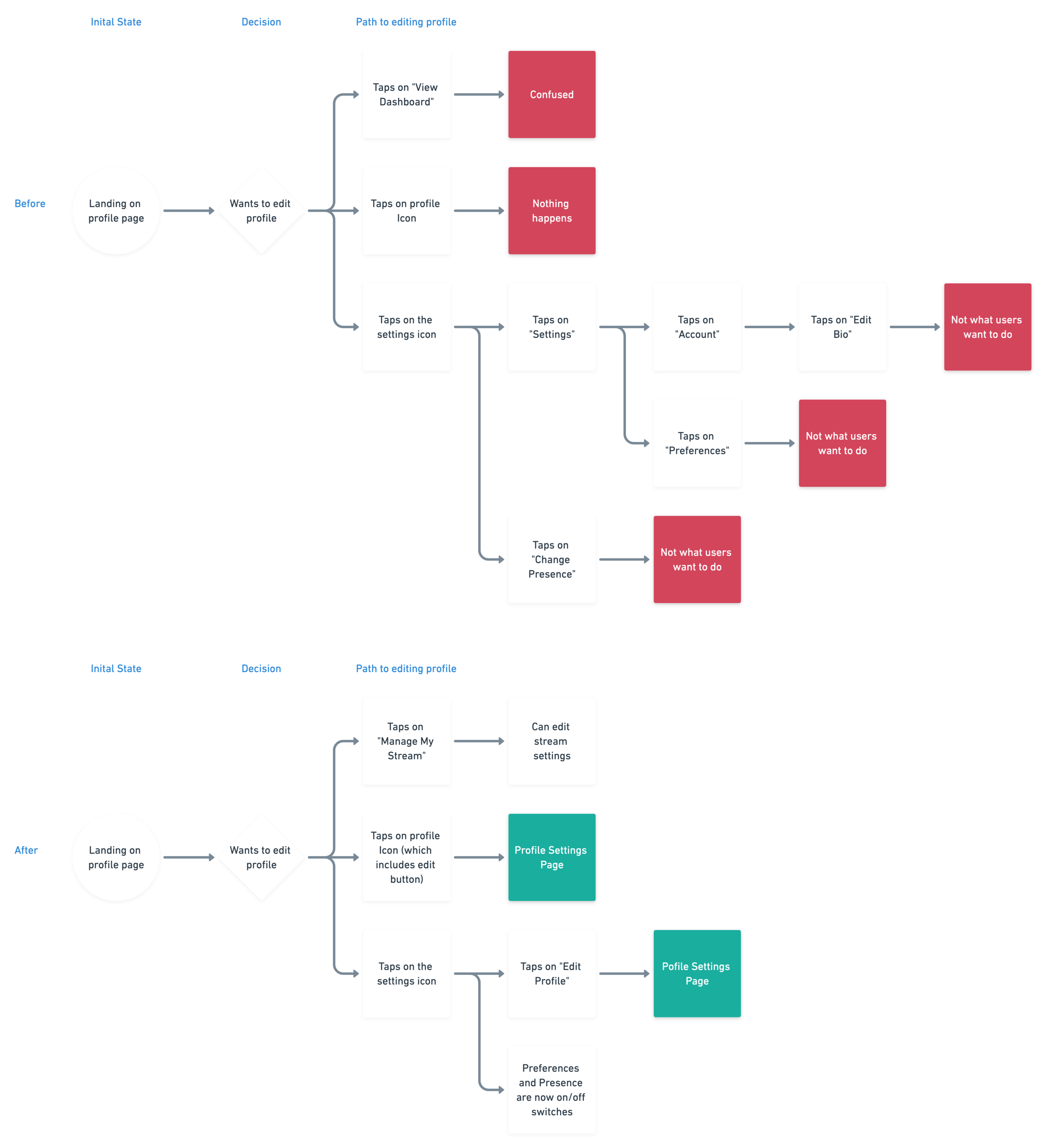
New user task flows
In order to better understand the user’s paint points, I created user flows and task flows to visually conceptualize where users were getting stuck and/or frustrated


Low fidelity sketches
I drew four iterations of low fidelity sketches aimed at alleviating user frustration, then chose the best two (green) and refined and iterated on them


Wireframes and high fidelity

The wireframe shows new users relevant content, all in one place


High fidelity mockup with images, icons, copy and symbols

Final results, before and after
Before

Users can either watch a random channel, or bounce to a difference page to find relevant content


Users now see relevant content right away, all on a single screen
After

Pain point two: not enough personalization
The profile settings page doesn’t let users fully edit their profile information, which means that users are unable to customize their profiles to their liking
Profile editing task flows
In order to better understand the user’s paint points, I created user flows and task flows to visually conceptualize where users were getting stuck and/or frustrated

Low fidelity sketching
I drew four iterations of low fidelity sketches aimed at alleviating user frustration, then chose the best two (green) and refined and iterated on them


Wireframes and high fidelity

Now, users can edit all of their profile settings from a single page


High fidelity mockup of the new profile settings page

Final results, before and after
Before

Users need to take multiple steps to make changes to their profile
The copy is confusing and limiting


Now, users can clearly see what it is that they are editing, and make changes in a single step
After

Bringing the redesigns to life
I prototyped the high fidelity mockups in Sketch to allow users a more realistic experience during validation tests
New onboarding flow

New profile settings

During the validation tests, user interaction with the redesigned landing page increased by 40% and every user was able to navigate to the account settings page in a single tap and update their profile image (100% increase)

Takeaways
By redesigning the onboarding flow for first-time users, I was able to improve interaction with the new landing page by 40%. Additionally, the newly redesigned profile page allows users to quickly and easily update their profile information
My biggest challenge was making certain that new users would find value in the redesigned discover page, and I learned to overcome it by quantifying the value. By measuring the number of users that interacted with the page before bouncing to a different one, I was able to see the difference between the original and the redesign. Before, 3/5 users bounced to a different page, and after, only 1/5 users bounced.
What I learned from the process is that most users are impatient, and that’s a good thing. Users don’t want to have to navigate through the app to complete the task at hand; they want their problems to be solved as quickly and as painlessly as possible. A higher demand for intuitive design makes for faster, more frequent design iterations, which results in better overall experiences.
If I had more time, I would likely continue to iterate on the profile information page. I would love to design an interface that is beautiful, simple, and empowering. Although it is certainly a step in the right direction, I think my current redesign has a ways to go, and I am confident that I can get there by iterating, running more validation tests, and iterating again.